HEWI MAG / Knowledge
Room design suitable for dementia: Here's what you should consider when planning
Three tips
Currently, around 1.5 million people in Germany suffer from dementia. As the disease progresses, people with dementia find it increasingly difficult to assess dangers. It is not only outdoors that there are things that could be dangerous for them - their own home also harbours risks. Accordingly, it is important to protect those affected. The design of rooms has a major influence on this - both in private and in hospital environments. But what can you do to implement dementia-friendly room design?
Whether private flat or house or Care facility: The most important thing in dementia-friendly room design is clarity. Simple furnishing of the living space helps to orient oneself, because dementia patients are quickly overwhelmed. At worst, too much furniture or furnishings will make them unable to find their way around the room. Therefore, the facility should be reduced to a minimum and tailored to the needs of the sick person. Because this makes it much easier for the person to find what they are looking for - even without support.
All older people want to maintain their independence for as long as possible. An age- or dementia-friendly room design ensures that people are not unnecessarily frustrated. Planners and architects should bear in mind that people with dementia find it increasingly difficult to orientate themselves as their illness progresses. Therefore, consider the following aspects to support dementia patients in their autonomy:
1. Focus on contrasts for dementia-friendly interior design
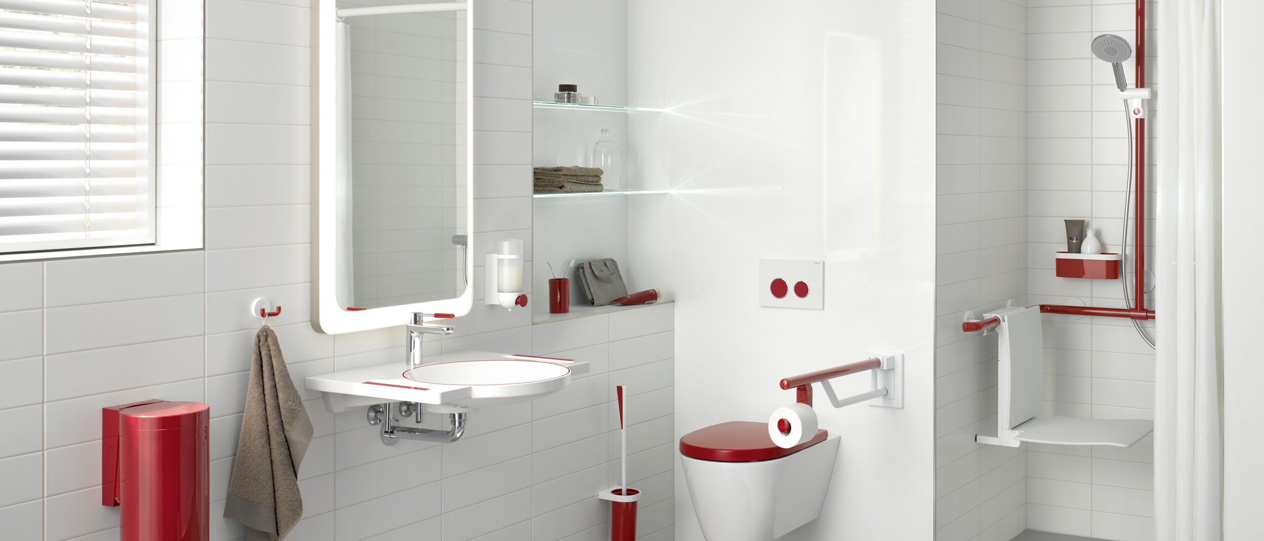
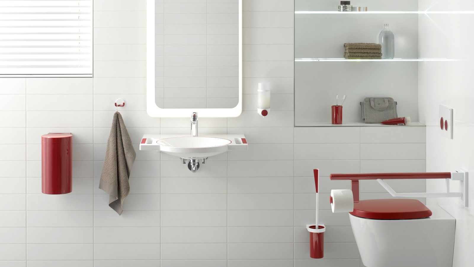
In addition to increasingly difficult orientation, dementia patients also experience symptoms such as forgetfulness or speech disorders. To enable them to act independently for as long as possible, it is helpful to offer them guidance. This can take the form of clear structures. Likewise, it is easier for them if they simply perceive their environment. Since the day often begins and ends in the bathroom, a high-contrast design is particularly recommended there. It helps people to find their way around better and to recognise the functional elements in the bathroom. With System 800 K we have created a sanitaryware series here that allows a richly contrasting scope for design. System 800 K builds on System 800 - the clear design language and the characteristically large radii are therefore also found in System 800 K. The basic colour is white - design the functional elements in colour as required.
2. The right colours for dementia-friendly interior design
Independently of dementia, protein deposits cause clouding of the lens in old age. Spectral components of the light are thus diffusely scattered so that they can no longer reach the retina. Older people can therefore no longer perceive colour contrasts with green and blue tones so well. Red and anthracite, on the other hand, they recognise the longest. Patients with dementia in particular recognise this colour more easily and also perceive it for the longest time in the later course of their illness. In addition, red is also the colour that people with inoperable eye diseases - such as macular degeneration - perceive best. In addition, this colour has a calling character for many people.
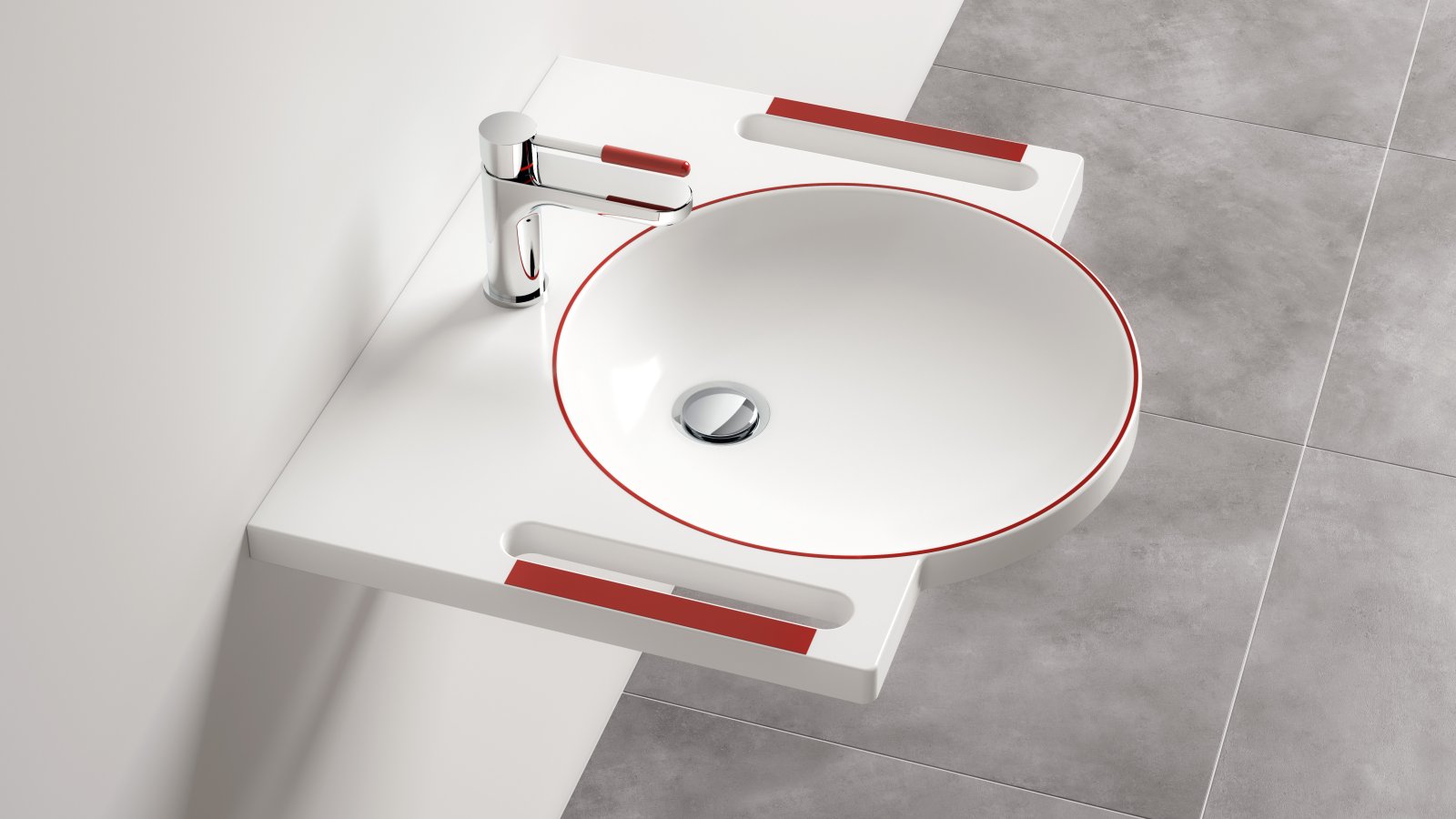
We have developed our HEWI dementia washbasin for precisely these purposes. This supports both people with dementia and people with visual impairments in the dementia-friendly room design. The functional elements are particularly accentuated by the HEWI colour 33 ruby red. Like all other HEWI washbasins this washbasin is also made of mineral cast with a non-porous, hygienic surface. In addition, it is wheelchair accessible in accordance with DIN 18040 and ÖNORM B 1600/1601 and is therefore also perfectly suited for barrier-free bathrooms.
3. Dementia-friendly orientation aids through contrasts
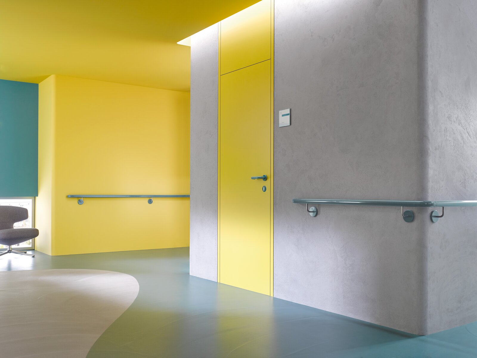
In Hospitals or nursing homes a well thought-out guidance system is often used - in the form of differentiated colour accents. By means of this design element, functional areas can be clearly demarcated from one another. Patients or residents can thus recognise individual floors or wards much better. Long corridors are ideal for colour-coordinated handrails Handrails door frames and Door handles door handles. With our subsidiary ENTRO, we offer modular solutions here. Handrails can not only Mark escape routes but also provide orientation. If patients do not have access to a certain area, then you as a planner or architect can use neutral colour accents for these areas. This makes them fade into the background visually.


